This section allows you to view all posts made by this member. Note that you can only see posts made in areas you currently have access to.
Messages - ChaIneD
1
« on: January 31, 2006, 09:02:10 AM »
ty, I am done now I think.. there is animation in it for the patient people under you  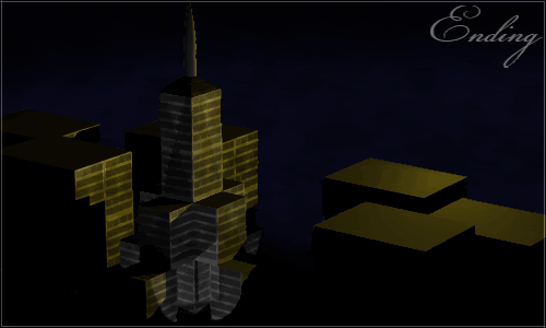 I personally don't really like the angle towards the buildings, but since it would take hours to re-render it, I won't edit it..
2
« on: January 31, 2006, 07:15:01 AM »
can I have some more time? I am dead tired right now, and myabe halfway done.. mainly because Ihad to do some computer-overloading stuff first.. the faster work is what I have to do now..
3
« on: January 23, 2006, 06:13:50 AM »
I vote for dil-bert, his one is more like hell to me than DMX's one.. more scary and evil.
4
« on: January 22, 2006, 11:14:22 AM »
ty guys, congrats Aries!
5
« on: January 22, 2006, 05:32:43 AM »
thx for those votes guys, actually it was meant to be messy, as a kind of protest against adverts getting lirrerally everywhere around you and it was not paint, TD, actually it was made in 3d
6
« on: January 21, 2006, 04:40:36 AM »
"530 login not correct" + "user posted iamge" = WTF?  no, not WTF, It's called a typo accidentally I copy-pasted the FTP link to it :$
7
« on: January 21, 2006, 03:31:10 AM »
 not exactly how I wanted it to be.. but I just couldn't get it better cya'll in the voting {- Lifę̉ is what I am selling, indeed -}
8
« on: January 21, 2006, 03:18:30 AM »
I really like both of them, but Tackleberry's one just ha a little something, I'ts just a little "off the normal path" so to say, something very different. Firefly's one just seems like a picture to me wth a border and some text (I know it's probably more than that, but just to explain..)
I vote for tackleberry
9
« on: January 20, 2006, 01:32:21 PM »
GL Aries hehe... I have had a nice idea about this kinda theme some time ago... time to work it out 
10
« on: January 18, 2006, 04:23:12 AM »
my vote: DMX, .priest's one has a lack of depth imo, and he did not use colors, which would look better I think. DMX has a nice variety of colors, it all fits together well. And I really like what he did w/ the border/name
11
« on: January 15, 2006, 02:55:17 PM »
well, I kinda like the idea of some with this so, here are the sigs I like most:      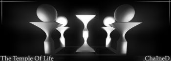 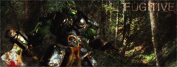   ---------------------------------------- I even made a render because I could never find a good version of this one: http://i18.photobucket.com/albums/b109/_Ch...of-persia-2.png---------------------------------------- I also have much 3D work, but since it is already in a gallery, I'll just add a link: http://www.marien.l3d.nl -> goto 3d -> Images { a direct link won't work with my current site configuration/setup } By the way, The Temple Of Life, the one from the sig, is also one of my 3d scenes. In fact, it is the center of a 3d world That is by far not all my 3d work, since I haven't rendered all I have (I use them in a 3d world). I will add pistures to that page frequently as possible, but probably only new work. cheers .ChaIneD.
12
« on: January 15, 2006, 02:34:50 PM »
 I really like that one, but you should REALLY kill that text.. it's kinda horrible imo that is
13
« on: January 15, 2006, 02:32:38 PM »
hmm When I thought of this one I thought of something more like DMX's one, but on the other hand, an arrow is jsut 3 cubes put together.. but since X said it's ok, its ok (y) for both
14
« on: January 15, 2006, 11:24:37 AM »
I vote for Fugitive, I think Tackleberry went pretty much over the top with his effects on both text and background
15
« on: January 15, 2006, 11:20:59 AM »
thx for comments guys, but why are there only 2 votes on the poll, whilst there are 4 people who commented? ^_^ some people must take a closer look at the topic I think
|